HUD designAugmented realityB Corp UKDesign for recyclingSustainable Product DesignNet zero carbonNet zeroCarbon footprintRegenerative designDoughnut economics meaningEconomic theorySocial capitalismDoughnut economics modelDoughnut economicsCommunication toolConsumer product developmentPhysical product prototypePhysical product designConcept designDesign for manufactureConsumer product prototypeDesign for bicycleAir filter designClean air designDesign engineering londonDesign Startup AwardDesign awardCircular designEngineering designEco friendlyWishcyclingGreenwashingResource conscious designB Lab UKIndustrial design londonDesign engineering consultancyManufacture product ideaDesign a productGet product manufacturedGet idea manufacturedIndustrial design studioProduct prototype processMake prototype UKGet product madeInnovation design consultancyIndustrial design companiesProduct design LondonIdea to productMake a prototypeProduct design london UKIndustrial design studio londonCreative engineeringProduct design consultancy londonProduct design agencyProduct design consultancyIndustrial DesignDesign engineeringSustainable DesignB CorporationB CorpSonySmart glassesHeads-up displayIron ManSpeedGravityCollaborationMentoringOpenSipsmith DistilleryIterationDesign processVRHeuristicsSignsEconomyHerman MillerSustainabilityPLALegoGoogle 20%Factory FridaysARIntellectual propertyLuma InstituteStakeholder mapFacebookGoogleAmazonAppleBill gatesDesign thinkingRetro-volutionLeaves on the lineTrainRSSBMicrowavesBrain plasticityBiomimicrySaboteurIdeasStephen JohnsonAdjacent possibilityVisual thinkingCreativityWearable techSports training aidIdeaProblem framingInventorInventionIdeationIPPatentSteampunk designSteampunkBoilerSolar steamSolar collectorSolar powerSolarSteam pumpSteam powerSteamDFIDSBRIInnovateUKBusiness cardsProduct designUpcycleAbundanceCircular economyCradle to Cradle MarketplaceEnvironmental designEnvironmentCtoCCradle to CradleInnovation trainingTrainingInnovationUXUsabilityHuman Centred DesignCentral Research LaboratoryCRLHCDModular designOpen designRobotsConsumer productsHUDCES20163D Print-UKSLS3D printingPrototypingElectronicsPCBDesign3D CADFritzingOnshape
TAGS

Sign of the times

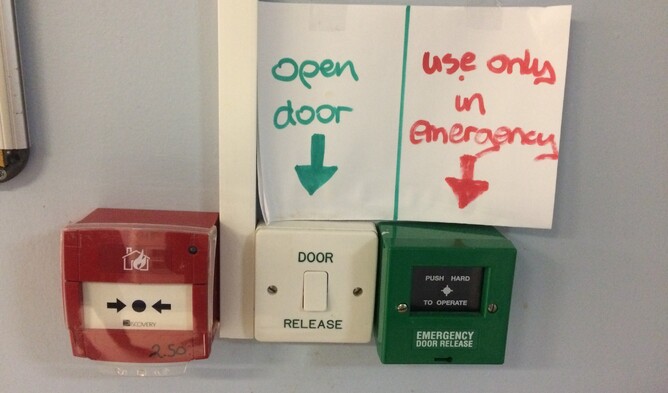
Yesterday I was visiting a relative in hospital when I came across one of those doors that is locked by a magnetic latch. So, as usual I looked to the wall expecting to find a push button that would release the door and came across the scene above.

Visiting someone in hospital is never an easy thing but when it's a stroke rehabilitation ward it's particularly stressful and your mind is full of all sorts of questions. So, the last thing you need is to be confronted with something as confusing as this array of signs and buttons.

Which button would you press in an emergency?

As a designer it raises a number of questions. Why was the push button release sandwiched between two emergency related buttons? Did the person installing it really have to place all three buttons so close to each other? It makes sense that a fire alarm button is red but why is an emergency door release green?

You can see how an enterprising person has attempted to provide some guidance through large handwritten signs with arrows pointing to the relevant buttons. Presumably, this came about through frustration from people pressing the wrong button causing staff to have to come and sort things out. Or perhaps like me they just found the button placement annoying.

The colour coding of the signs was a good idea but unfortunately it's just as confusing as the buttons themselves because of the lack of consistency. Our brains are wired to look for patterns so in this scenario what does green mean? Clearly red is for something urgent but there is a green button to be used only in emergencies.

So how do we avoid making mistakes like this when we are designing new products or services?

At The Imagination Factory we use something called the "10 Usability Heuristics" developed by Bishop and McQuaid at MAYA design.

This is a simple set of rules of thumb that act as a sense check on the usability of whatever you are creating:
  1. MATCH - match mental models
  2. COMPLEXITY - minimise perceived complexity
  3. CONSISTENCY - use consistent form, words and actions
  4. PLACE - provide a sense of place
  5. CONSTRAINTS - account for user and contextual constraints
  6. ANTICIPATE - anticipate people's needs
  7. LANGUAGE - use clear and concise language
  8. FEEDBACK - give feedback about actions and status
  9. ERRORS - prevent errors and allow graceful recovery
  10. AESTHETICS - strive for appropriate aesthetics
I wonder how different the experience of leaving the stroke rehabilitation ward would have been if someone had taken the time to anticipate my needs as I approached the door, installed the buttons to minimise the complexity of using them and used consistent colours and words.
    By Mark Hester


    This product has been added to your cart

    CHECKOUT